Do you experience this: Your brain seems to explode because there is so much you try to fit into ”working” memory? It can happen on a Friday afternoon, after a busy work week. Or on a Monday, looking at your calendar while figuring out how to fit in all those meetings and still get real work done.
Maybe this example will resonate a bit more. While starting to troubleshoot an incident in your IT environment, there is so much to figure out. A lot of the information you need is undocumented and resides in the minds of colleagues. For example, how components relate to each other and also how they impact other components. Or, you are drowning in terabytes of disparate data and trying to piece it all together. This is overwhelming to work through. Finally, you have time pressure – perhaps it’s a business-critical service that is down and you are getting pinged repeatedly asking when it will be back up again.
Does any of this sound familiar?
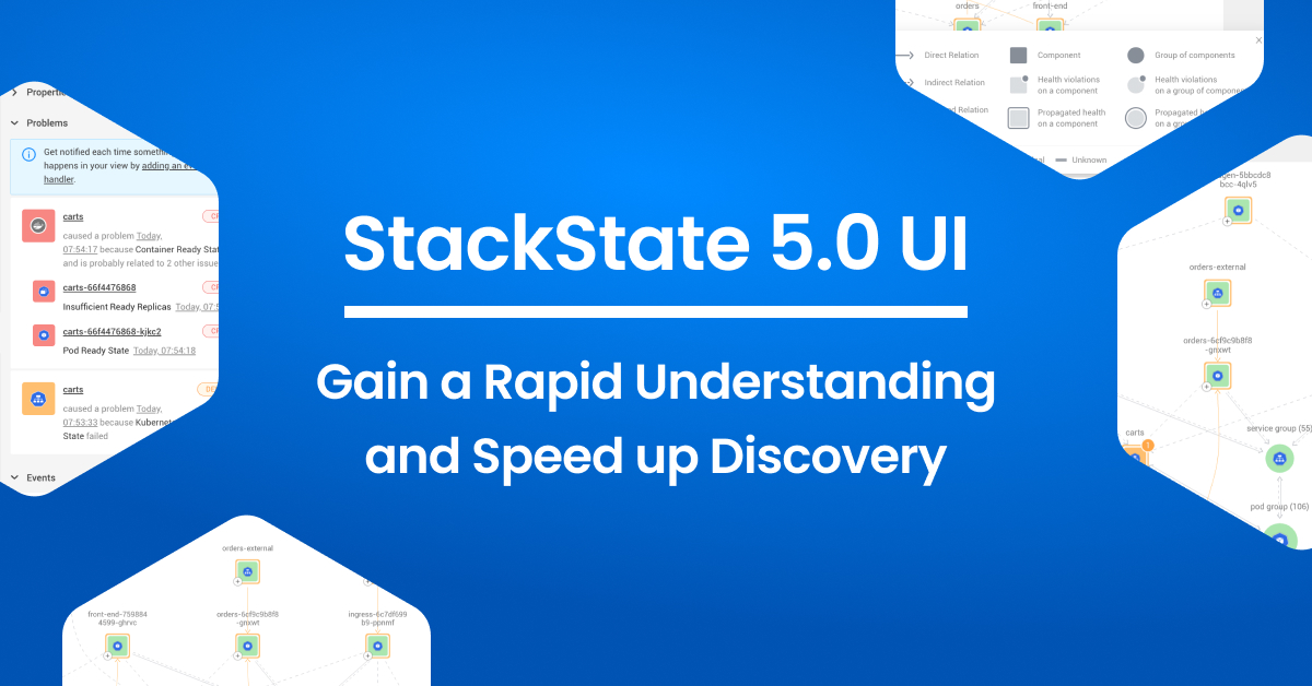
At StackState, we understand that having too much information or not having the right information at the right time isn’t helpful at all. With our v5.0 release, we have made another big step forward in supporting you on your journey of easily discovering the right information to resolve incidents quickly.
Impact of a new UI and interaction pattern
At times, when information overload can become reality, you need to consider how to simplify and drive attention to the things that matter. With StackState v5.0, a new simpler UI will do just that. This release brings an entire overhaul of the StackState UI, with very visible as well as more subtle changes. Together, they drive a clear improvement in user experience.
Visible changes in the StackState UI:
Updated color scheme. We’ve added a fresh and modern color scheme to bring you the same experience as other apps you’re using.
Propagated health* is no longer shown on all components. This will reduce the information you see at first glance. However, as soon as propagated health becomes relevant with a component becoming a deviating or critical state, it will be shown. Having this visible only in the context of the issue will drive the right action and focus attention to where it is needed most.
* Propagated health: In addition to an element’s own health state, StackState calculates a propagated health state for each topology element (components, component groups and relations). The propagated health state is derived from the health state of components and relations that the element depends upon. The propagated health state will help you to understand the risk of affecting other components when the health of a component they depend on declines .
The more subtle changes in the StackState UI:
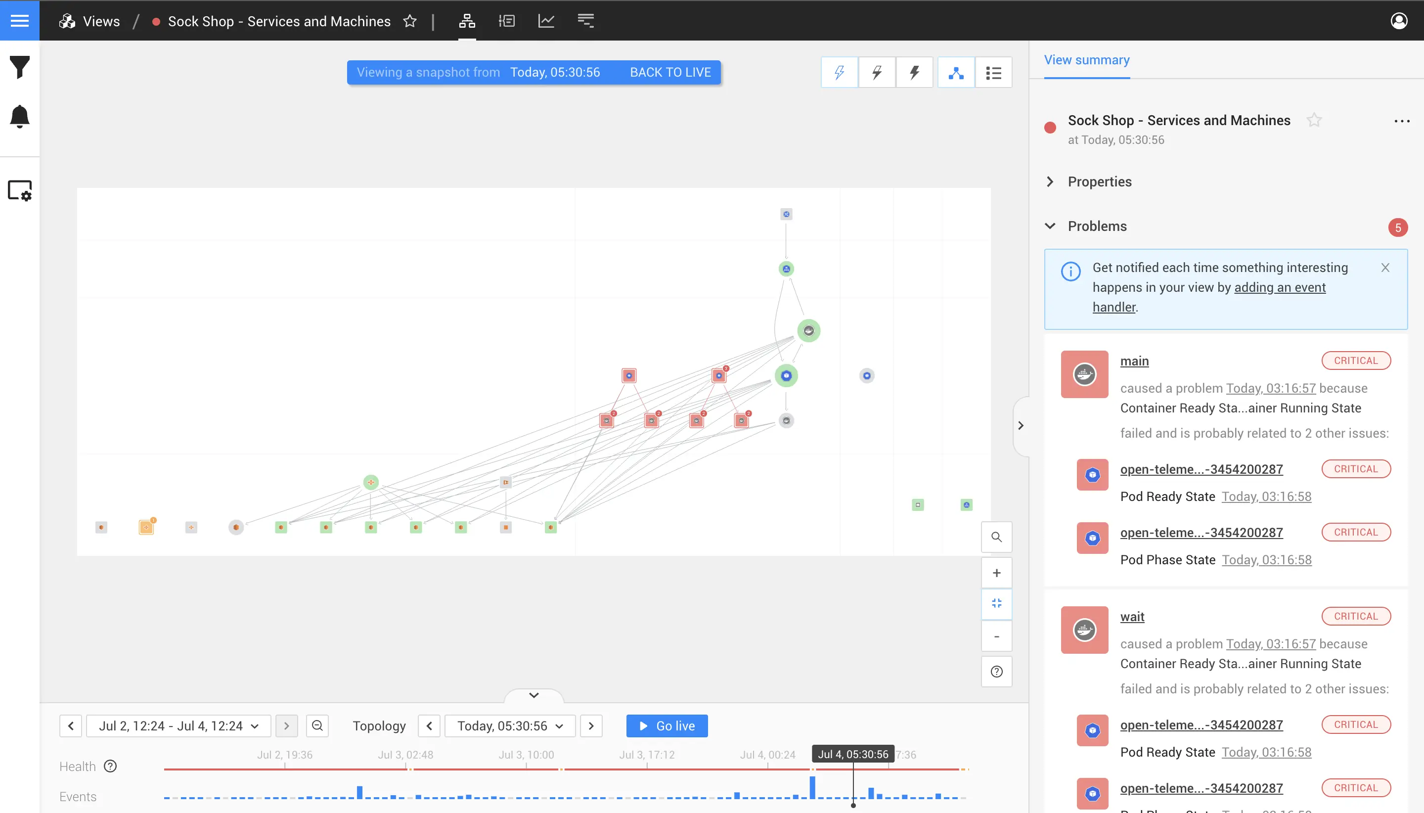
Failures are more clearly visible in the Topology Perspective. Previously, failures were hidden in the Topology Perspective and only reflected by the color of the components, with (green indicating a healthy state, orange indicating that the health state was deviating and red indicating a failure. Orange reflected an early warning when something might go wrong). Now, when a monitor detects a failure, it is visible in the Topology Perspective and elevated to a badge on the component. In one glance, you now see what component has failing checks, and how many are failing. (Note: We have also taken accessibility into consideration in selecting the new colors. For those of us who are colorblind, the new colors are more readily distinguishable.)
Circles now represent groupings of components; these circles are more distinguishable than the hexagons we previously used.
Searches are a smoother user experience when zooming into a component using the topology view. With large topologies, it’s sometimes hard to retain the big picture and to realize what part of the topology you’re drilling into. The new animation in v5.0 makes it much easier for you to see how you are navigating from component A to B and where the components are located in the topology.
Finally, all of these visual changes will help engineers who are new to StackState to onboard much faster, decrease their dependence on more experienced colleagues and increase their level of self-sufficiency.
Going from having a great overview towards the cause of the problem
Just having full-stack observability of your entire IT environment - through the lens you have defined to reflect your business - is not enough to solve problems when they occur. To get to the cause of the problem and solve it as quickly as possible, you need more.
StackState provides many capabilities to drive the detection of an issue. Some important ones are probable cause detection and the Autonomous Anomaly Detector. Although these smart capabilities can bring you to the root cause of the problem, manual discovery is still often beneficial to get an even better understanding of the context.
Retain context as to where you are in the topology while swiftly navigating to issues
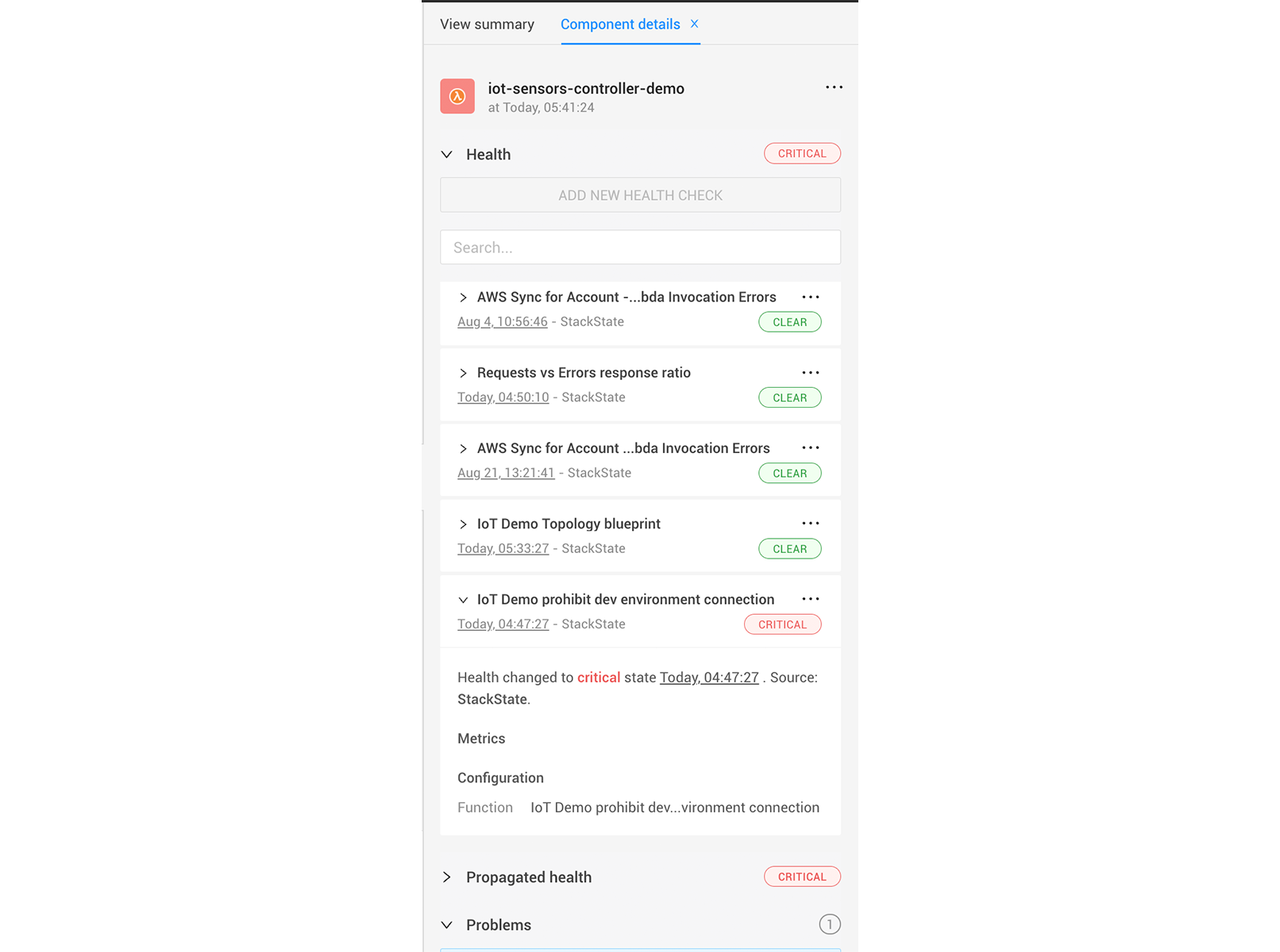
With the v5.0 release, we have also adjusted the right panel of StackState. In the past, it just had a single layer, and, while clicking through, you would sometimes lose context. Questions like “Where did I start this discovery path?” and “What other paths can I travel?’ were hard to answer.
The new ‘Details tab’ will allow you to go deep into discovery while the original starting point remains in the ‘View Summary tab’. This is particularly helpful if you want to zoom into a probable cause, an event or any other detail that might add context to the issue.
This second tab showing all the details provides you the ability to go back a single step or multiple steps within your discovery, without changing the entire main view of the system.
Last but not least: If you are on to something and you want to share information with one of your co-workers, you can share the exact view with them, including your discovery path.
StackState v5.0
Besides these UI improvements to drive rapid understanding of incidents and expedite discovery, many more great capabilities have been added to increase the ease of managing your environment, while reducing issues from happening.
Read the full v5.0 Release announcement here.