When it comes to using (desktop) software, especially in tech, there's always that icebreaker you can use to determine whether a prospect is a more "visual" or a more "textual" user.
You ask, “Which do you prefer, the GUI or the CLI?”
They answer, “I prefer the GUI.”
You follow-up: “Are you more keyboard-first or more mouse-first?”
It’s definitely not a black-or-white debate, but it's always interesting to see just how differently we’re wired as individuals at a cognitive level.
In this blog post, we'll assume you lean towards being a more "visual" type of person. We'll take a closer look at StackState's UI and how you can use it to level up your troubleshooting game by efficiently navigating the different dashboards and pages StackState provides.
If, on the other hand, you're a more "textual" type of person who prefers the CLI, please check out our GitHub . Either way works with StackState!
Before you read further, please bookmark this blog post. You might want to revisit it later to see how you can become even more efficient.
Keyboard shortcuts for StackState
Try the following keyboard shortcuts in any view to quickly browse through Stackstate:
SHIFT + 1opens the “Highlights” or the “Overview” perspective to see the health of all the resource(s) in your view at a glance.SHIFT + 2opens the “Topology” perspective to show all the dependencies between the resources in your view.SHIFT + 3opens the “Events” perspective to understand what happened to the resource(s) in your view.SHIFT + 4opens the “Metrics” perspective to see all the out-of-the-box metrics matching the resource(s) in your view.SHIFT + 5opens the “Traces” perspective, which allows you to find exactly what is keeping your customers from a superior experience.CTRL + SHIFT + Ssaves the view as a new view.CTRL + SHIFT + Rresets unsaved changes to the current view.

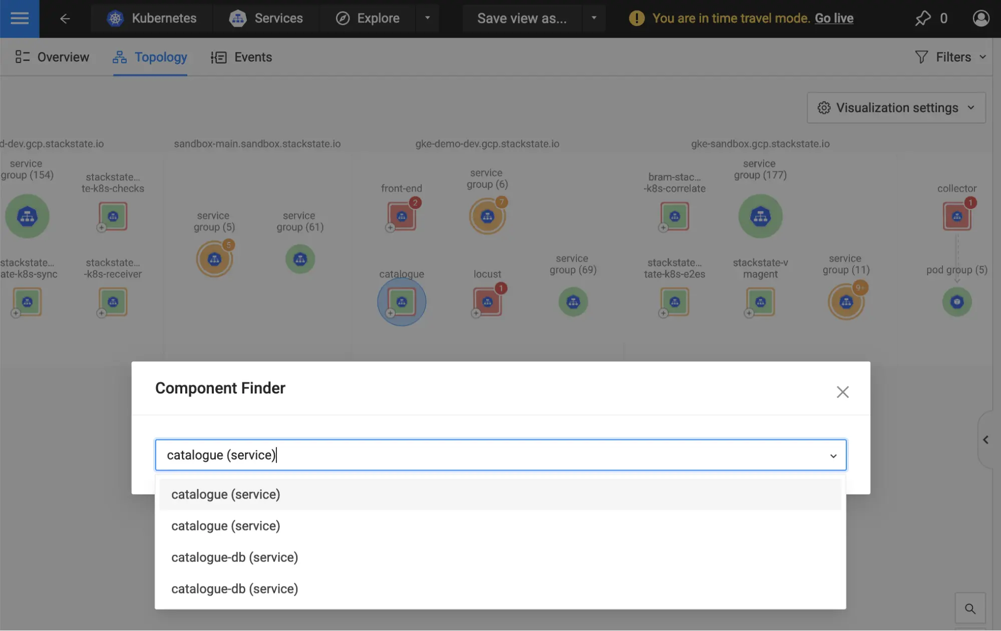
On the “Topology” visualizer, you can use the following shortcut to speed up resources lookup:
CTRL + SHIFT + Fsearches for — and jumps to — a component by name.
If you want to magically improve data correlation, try the following shortcut:
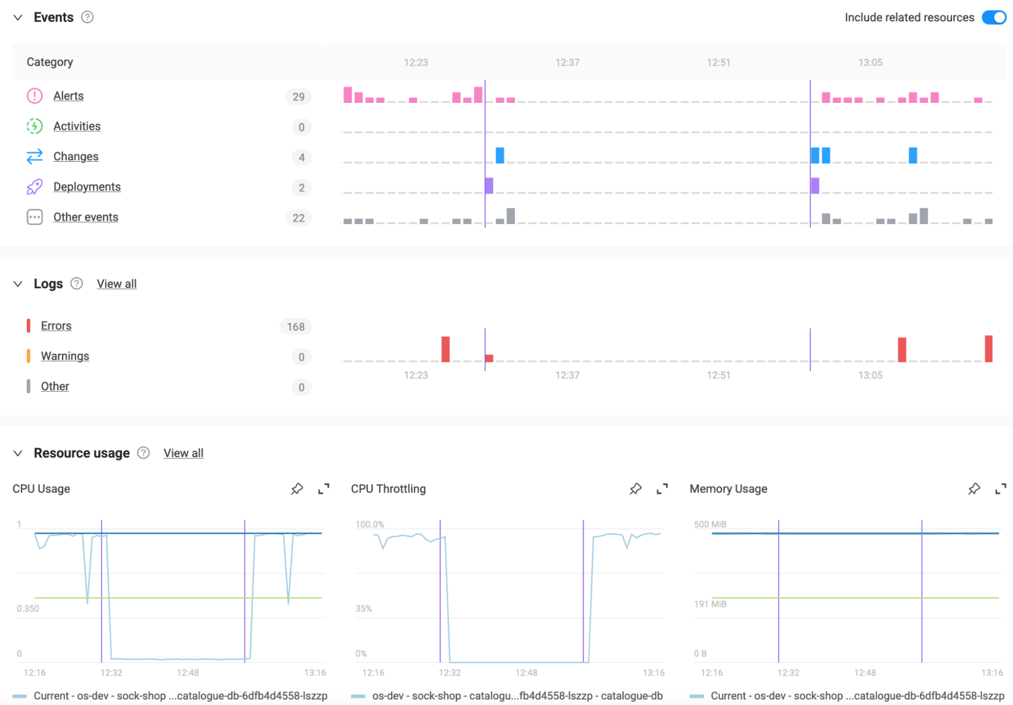
SHIFT + CLICKon any chart or timeline to add a vertical (purple) marker at that moment in time. This will impact ALL the charts and timelines across the UI, regardless of the page you’re on, allowing you to visually correlate data everywhere in the application: logs, events, metrics, health and more.Add multiple markers: Shift-clicking at different moments in time adds multiple markers. Use this to highlight the beginning and end of an issue or the spike of a metric, for example.
Remove markers: Shift-clicking again on an already existing marker removes that marker from ALL the charts and timelines across the UI.
💡 Do you have an idea for a new shortcut? Reach out to us
Topology navigation in StackState
When you’re exploring the “Topology” visualizer and trying to connect the dots, consider the following actions to help you get the most out of it.
Hovering over a component for a brief moment displays the component popover. This reveals important key metrics, health status and quick actions applicable to that component at selected moment in time — if you’re in live mode, the key metrics and the health status will update every few seconds.
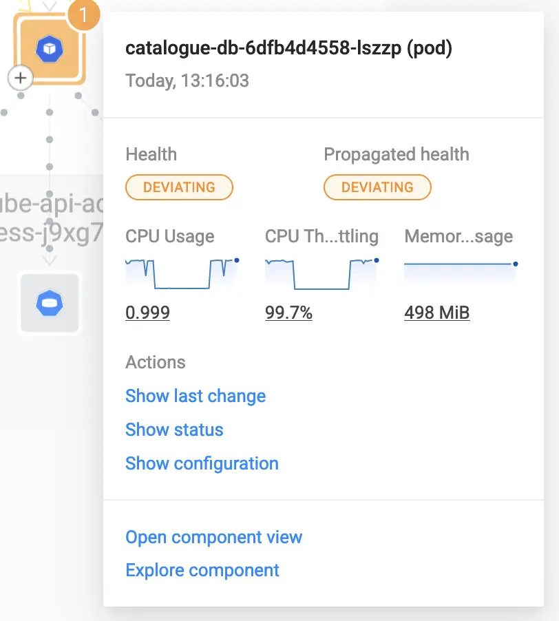
Depending on the component type, the popover might also include additional actions. For example, in a Kubernetes environment, hovering over a “pod” component will give you access to the following actions: “Show last change,” “Show status,” and “Show configuration.” These provide you with additional information about that resource in its topological context. This can be extremely valuable during an investigation.
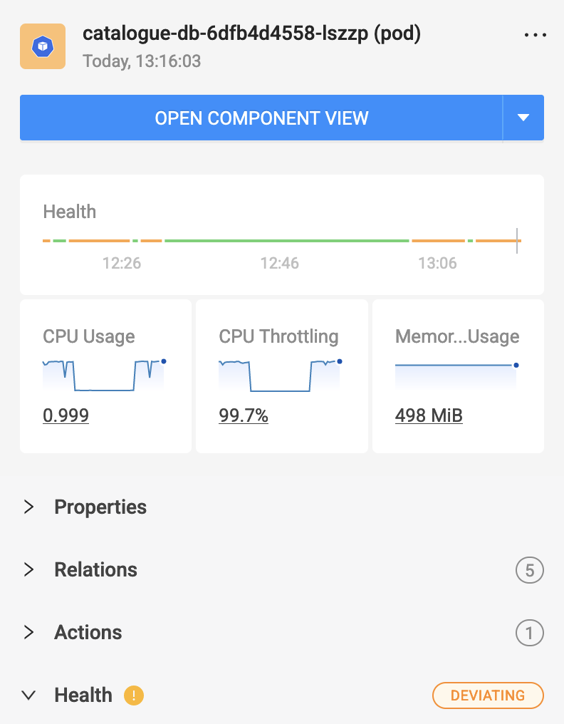
Clicking on a component opens the right-hand side panel, which displays a few high-level details relevant to that component type (e.g., properties, metrics, monitors, relations, etc.) at that moment in time.
This shortcut is especially useful if you want to compare data, like the "error rate" metric or the "pod ready state" monitor, from one component with data from other components. They also help when you need extra information about a component without losing your place in the topology.
Double-clicking on a component opens a new dependency map in the “explorer” (a temporary view), where the recently clicked component becomes the center of the topology. From here, you’re free to expand and change anything without the fear of altering the initial view you started from. When you’re done, you can either save the result as a new view, OR you can just dismiss it, get back to your original view and continue from where you left off.
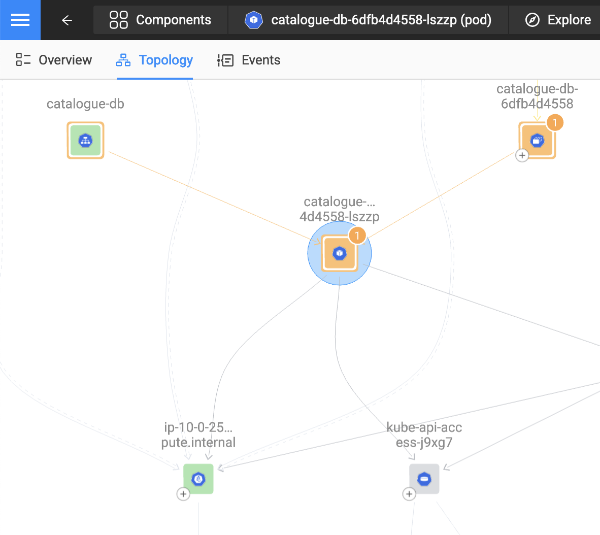
Clicking on a relation or group works just like clicking on a component. It opens the right-hand side panel to show you high-level details relevant to that relation or the list of components in that group.
Double-clicking on a relation or group follows the identical path as double-clicking a component. It opens a new dependency map with the recently clicked relation or group at the center of the topology.
✨ Try out these actions on our playground and let us know what you think.
StackState tips and tricks to help you go faster!
There are quite a few capabilities and features in StackState’s UI that will make your life easier — they are built to help you navigate a complex IT landscape even if you don’t know exactly how all the underlying resources are related to each other.
Here are the top 5 most important capabilities and features:
1. Related resources section
Depending on the resource type, each component page contains an insightful overview of all the related resources and their corresponding health states. It is located on the left side of the “Highlights” perspective, just below the “About” section in our dynamic dashboard layout.
For example, the above screenshot shows the related resources of a namespace in a Kubernetes environment. At a glance, you can see how healthy it is and navigate directly to all the resources within the namespace. No domain knowledge is required to understand what a namespace is or consists of.
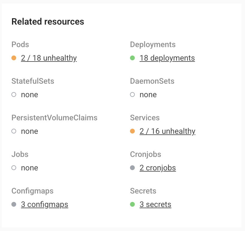
Generating the related resources overview is possible due to StackState’s underlying graph database. It allows you to see how everything is connected, regardless of the type or size of your environment.
2. Follow-me function for remediation guides
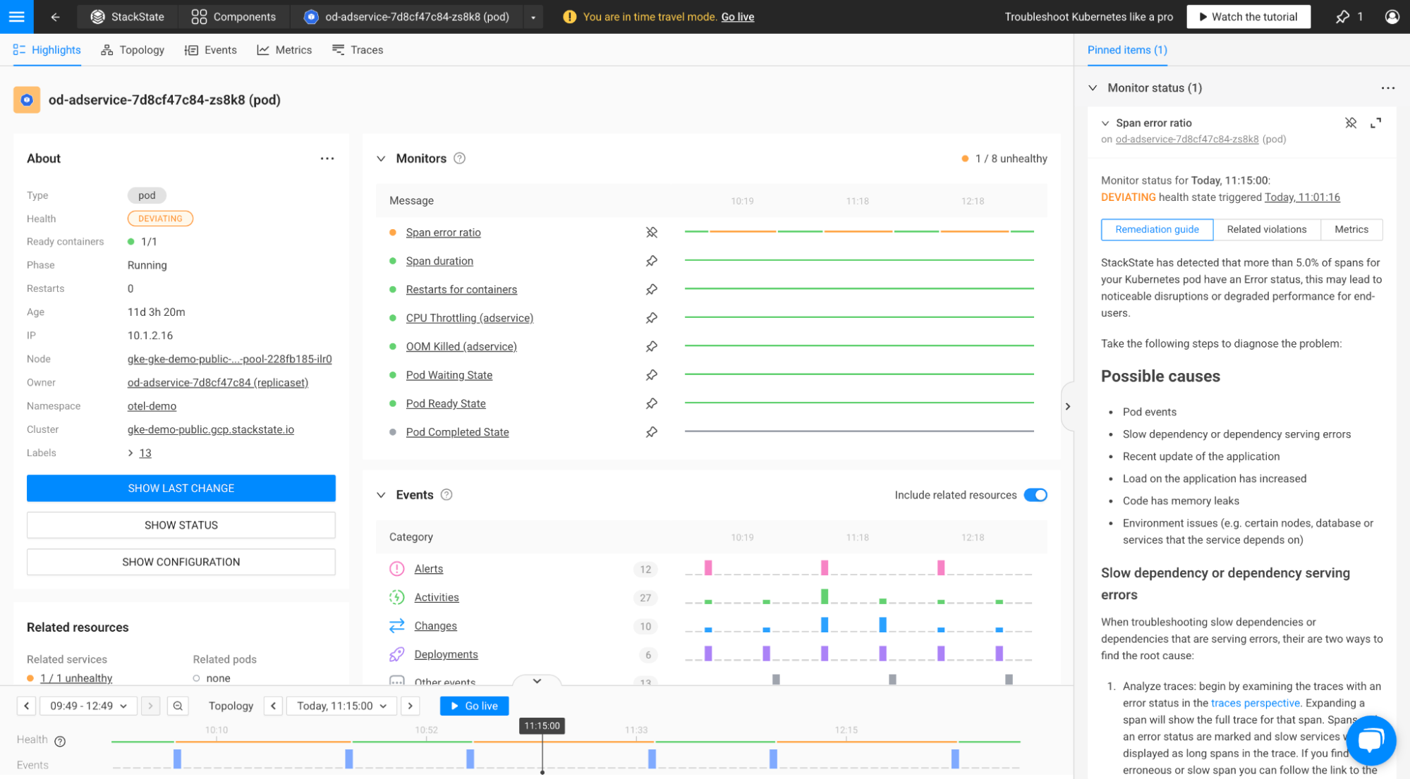
If you’re troubleshooting an issue, it’s super useful to have your playbook right next to you to avoid switching back and forth between your environment and the steps you need to take to remediate the issue. That’s why we’ve designed a “Follow-Me” function for all our remediation guides — it is turned on by default, but you can disable it at any time.
When a monitor generates an unhealthy state on a resource, StackState provides an out-of-the-box remediation guide to help solve the issue. Following the steps and clicking on any link included in the remediation guide will automatically “pin” the monitor status to the right-hand side panel. You can also do this manually by clicking the “Add to pinned items” button on the monitor drawer.
Once pinned, the remediation guide — together with the related health violations and the monitor-triggering evidence — will “follow” you across all the views you browse through until you finish your investigation.
3. Your own little scratchpad
Short notes, charts, actions, reminders or a phone number. Who doesn't have a small piece of paper next to the keyboard full of scribblings?
At StackState, we realized that troubleshooting an issue usually requires you to “write down” different bits of information. That’s why we’ve created the “Pinning” concept — this extends the previously mentioned “Follow-Me” function to metrics, events, traces, logs, or topology snippets. For now, we’ve added support for pinning the metrics and the monitors, but the rest will follow shortly.
We envision the scratchpad becoming a central part of StackState in the near future. It will allow you to merge charts and snippets together, create customized dashboards or export them for post-mortem analysis, effortlessly expanding your troubleshooting capabilities.
4. Navigate to your previous pages
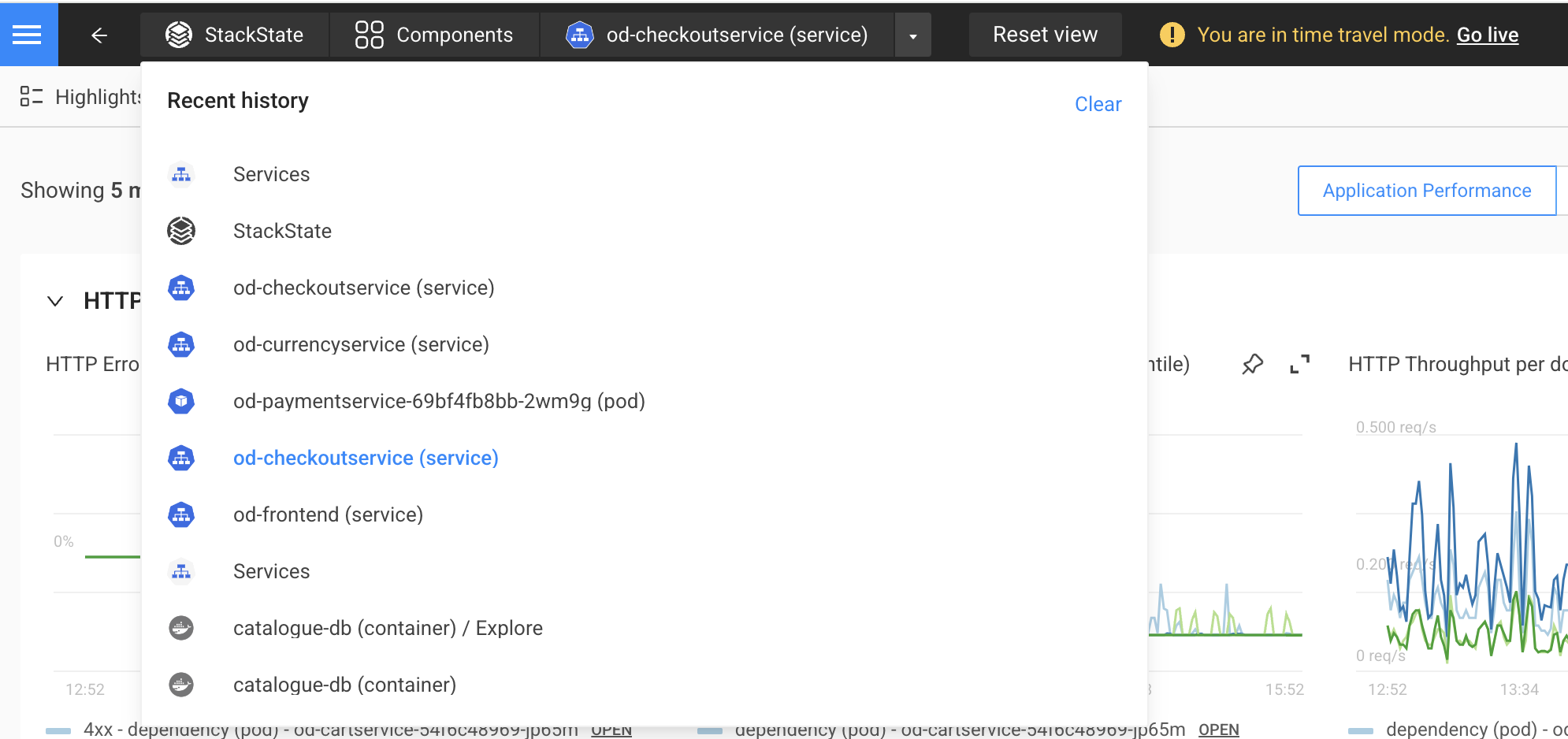
Switching back and forth between a dashboard and a dependency map, navigating from a service to its hidden neighbors, shifting between sets of filters, or jumping from the present time to moments before an incident began — these secondary paths clutter your browser’s navigation history. As a result, it becomes challenging to quickly switch between all the high-level pages you've visited during your investigation.
This is why we’ve decided to create the “Recent History” feature — a way to streamline the navigation between the main pages you’ve been on, without all the intermediate steps you’ve taken on each page.
You can easily reach it via the small arrow at the right end of the top navigation bar, as shown in the screenshot above. In this example, the user went 6 pages back (follow the blue line text), but you can navigate even further down, or back up to more recently visited pages.
5. Go back to the future
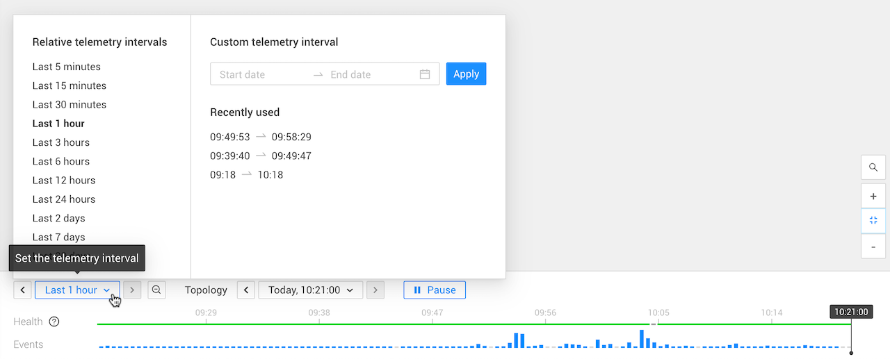
A unique feature we’re really proud of in StackState is “Time Traveling .” It allows you to travel back in time to view the state of the topology at a specific moment in the past. You can then navigate through all the telemetry available for that topology snapshot. The health and the events plotted on the timeline are meant to give you an overview of the state of the topology during the selected telemetry interval.
Besides the obvious controls that allow you to shift the telemetry left or right, zoom in and out, or select a relative or custom time interval, the timeline also features a hidden feature: it incorporates ALL the time intervals you have used across the application into the “Recently used” list so you can easily re-use them, making your investigation a lot easier.
For example, when you start an investigation, you typically check out a particular resource, then look at one of the triggered monitors and analyze one of the evidence metrics for that monitor. When you go back to the initial resource, the "Recently Used" list on the main timeline will show all the telemetry intervals you used up to that point, including the ones you’ve set up on the monitor status or the evidence metric. With these jumping-off points, you can easily adjust the telemetry interval and travel back to more relevant times to further your investigation.
🔥 Curious how everything fits together? Sign up for a free trial or reach out to schedule a quick demo .


